The First Apple Homepage

Update: Based on feedback from readers, it looks like this may still be the earliest Apple home page, but is more likely from 1993 or early 1994.
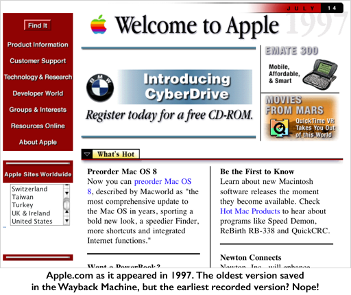
Last week I happened across a blog post showing the history of Apple.com over the past 17 years, complete with screenshots culled from the very earliest days of the Internet Archive Wayback Machine. It’s a serious trip down memory lane, but it didn’t go back far enough. This is the earliest mirror of Apple.com, captured shortly after the Wayback Machine went live:
But that was 1997. What did Apple.com look like at the very birth of the World-Wide Web? Say around 1992?
I’m a digital pack-rat, and I’ve been on the Internet a long time. I remember a very different, more playful Apple.com homepage. I remembered a page that was more Fractal Design Painter and less grids and columns. I remember taking a screenshot of that page because I liked the look of it. But where would it be today?
Every four or five years I migrate my life-backup to a bigger drive, both for redundancy and to make room for new stuff. The result is a nesting-doll of archived data. Searching for images with “apple” in the filename didn’t turn it up, so I did what any archaeologist* would do. I dug down to the proper level sifted through the file hierarchy by hand. [*any archaeologist would actually be fired and ostracized for digging willy-nilly through layers to get to what he’s looking for, but that’s imperfect metaphors for you.]
The proper level in this case was an archive of a backup that had been burned to CD-R in 1995, found on a spindle in a cardboard box in 2006 and copied into the life-backup a couple hard drives ago. Still fruitless in my search, I wondered if I might have stored it in the Scrapbook for safe-keeping. For those of you who haven’t used a Mac prior to OS X, the Scrapbook was one of many Desk Accessory apps you could get to any time from the Apple menu. It was a sort of super-clipboard where you could paste items in and page through them like a scrapbook to get at them later (sometimes, apparently, decades later). People usually used it for clip-art. It even came with a half-dozen pieces of clip-art to get you started.
I copied that backup’s Scrapbook file to my computer and used Photoshop to try and extract the PICT resources containing the individual images. No go. A little Googling found that the venerable GraphicConverter would do the job. GraphicConverter, by the way, has been serving the needs of Mac users for over 23 years, keeping backward compatibility alive.
Paging hopefully through the default images, suddenly there it was. It was so tiny! And oh god, so pixellated. But this was absolutely it. Without further ado, the earliest known (so far as I can tell) Apple home page:
There are a bunch of things to note here:
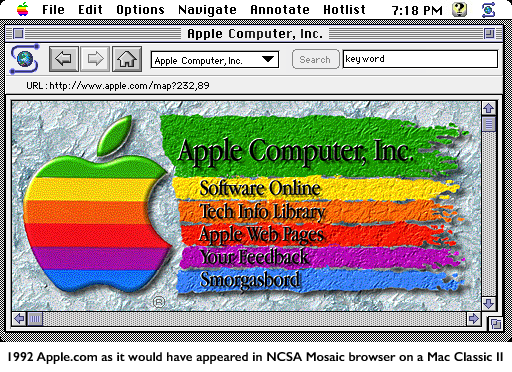
- Tiny! Remember, this had to look good on the computers of the day, and that included the Mac Classic II, with a screen size of 512 by 342, as opposed to today’s megapixel HD displays.
- There is no real text. The entire page is one graphic with text burned-in.
- The pixellation is completely normal for the time when ‘web safe colors’ actually meant something and most color monitors displayed only 256 colors.
- Bevels and drop-shadows, oh my.
- Navigation was by way of a server-side imagemap. You’d click on the image and the browser would send the x and y coordinates of the click to the server, which would use them to decide what URL you should be directed to and send a redirect. Client-side imagemaps wouldn’t be a part of the HTML spec until HTML 3.2, but that was 5 years away. Javascript? It wasn’t even a thing. Heck, when this page was live you couldn’t even put text on the same row as an image.
- Search? There wasn’t such a thing as a text field in HTML at this stage. Browsers had a native Search box that would send a search request to a URL defined by the page, if the page supported search at all. Search engines weren’t even a thing back then, and you were more likely to find what you needed on Gopher or Usenet than the web.
- Smorgasbord?
To give a little more context, I used a few screenshots of NCSA Mosaic and some reconstructive photoshopping to replicate as closely as possible how this would have looked on a Mac Classic:
So there you have it. The earliest Apple.com web page I know of. At least 22 years old. If this post makes its way to an Apple archivist who has any more definitive data or an earlier screenshot or mirror I’d love to see it!


